

Why Most Chart of Accounts Templates Fail (And What to Do Instead)
If you downloaded a chart of accounts template from the internet, there’s a good chance it’s built for your tax CPA, not for running your business. And that’s a problem. A poorly structured chart of accounts makes your financial reports confusing, your margins unclear, and your decisions harder than they need to be. If your income statement isn’t helping you manage the business week to week, the real issue might be how your accounts are organized. In this guide, we’ll show you how to set up a chart of accounts that’s built for visibility, not just for filing taxes and give you a chart of accounts template that works from day one.
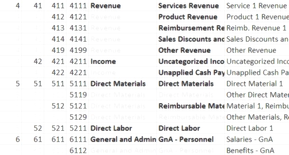
The chart of accounts is a financial organization tool that lists every account in your accounting system – accounts are the ‘buckets’ where you put every business transaction. For example, when you rent a car you record it to \’Travel Expense\’, an expense account on your chart of accounts; when you invoice a customer for a completed project, you record it to \’Service Revenue\’, an income account on your chart of accounts.
Recording transactions to a specific account is what makes it possible to review the performance of your business at a glance. That is if, and this is a huge if, your chart of accounts is organized correctly. If not, you won’t be glancing at reports and making fast decisions. You’ll be lost in the trees, unable to see the forest forever confused about your business’ finances.
Following these three tips will help you set up your chart of accounts correctly the first time, saving you time, money, and frustration. Click the button to download our full chart of accounts template to follow along.
Why You Shouldn’t Let Your Tax CPA Set Up Your Chart of Accounts
Your Tax CPA will define your chart of accounts (COA) in a way that makes filing your taxes easy – but that is a once per year event (or at most four), whereas you have to live with your COA the other 364 days out of the year. You don’t want your chart of accounts aligned solely to the IRS’s (sometimes senseless) deduction and credit rules – you need accounts that correspond to how you actually run your business, for your daily, weekly, and monthly reporting and analysis.
How to Set Up Revenue and COGS Accounts to Accurately Measure Margin
Margin may be the single most important metric for your business. To calculate margin by product or service line you need to setup matching revenue and cost of goods sold (COGS) accounts.
This template is designed for small business owners not for managing household budgets.
Chart of Accounts Examples: Revenue Categories by Business Type
First, for revenue, think about your different revenue streams and group them into broad functional categories. Three or four categories are usually sufficient for a small or medium-size business (SMB), or even just one might be enough. These categories become your primary revenue accounts.
Below are a few examples, including how you may use sub-accounts to show additional detail.
Software Company
- Consulting Revenue
- Software Revenue
- Other Revenue
General Contractor
- Building Revenue
- Residential Building Rev
- Commercial Building Rev
- Service Revenue
- Parts Revenue
- Other Revenue
Manufacturer
- Product 1 Revenue
- Product 2 Revenue
- Service Revenue
- Other Revenue
A NOTE ON LOCATION TRACKING: DO NOT use accounts specific to geographies (e.g. Project Revenue, Pacific Northwest). To report by region or location use tracking categories (a.k.a. ‘classes’), and run reports that break out revenue and costs by class. You can setup a separate list of classes in your accounting software, and then as you record transactions, you assign each to a class.
How to Structure COGS Accounts by Business Type
Now that you have revenue figured out, you’re ready to set up your cost of goods sold accounts. This is simple – create matching accounts for each revenue account. The only complication is breaking COGS out into materials and labor, so that you can track what you spend on raw material inputs versus people inputs.
Software Company
- Direct Materials
- Direct Materials, Consulting
- Direct Materials, Software
- Direct Labor
- Direct Labor, Consulting
- Direct Labor, Software
- Other COGS
General Contractor
- Direct Materials
- Direct Materials, Building
- Direct Materials, Residential Building
- Direct Materials, Commercial Building
- Direct Materials, Service
- Direct Materials, Parts
- Direct Materials, Building
- Direct Labor
- Direct Labor, Building
- Direct Labor, Residential Building
- Direct Labor, Commercial Building
- Direct Labor, Service
- Direct Labor, Parts
- Direct Labor, Building
- Other COGS
Manufacturer
- Direct Materials
- Direct Materials, Product 1
- Direct Materials, Product 2
- Direct Materials, Service
- Direct Labor
- Direct Labor, Product 1
- Direct Labor, Product 2
- Direct Labor, Service
- Other COGS
Why Margin Accuracy Depends on Chart of Accounts Setup
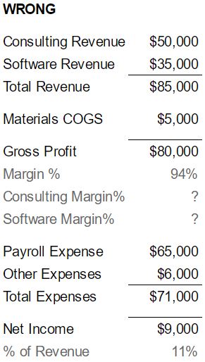
Doing the hard work of setting your accounts up correctly makes calculating margin by product or service line easy. The simplified example PnL below shows what happens when you setup your chart of accounts the wrong way versus the right way. In the wrong way, the company overstates margin because it records all labor to Payroll Expense (rather than recording the direct labor portion to COGS), and it’s not able to compare consulting margin to software margin. If your chart of accounts is right, you’ll know your true margin and be able to compare your products or services to one another.

How to Organize Your Chart of Accounts (and Keep It Clean Over Time)
Even if you’re business is pretty simple with just a few employees, there will be a lot of different categories you will use, and these can get confusing. If you don’t keep your chart of accounts organized, your Income Statement and Balance Sheet will be pretty useless and you’re back to bank account business management – Money in the bank? Hire, buy, invest, spend. Cash running low? Fire, cut, trim. Not the best way to run a business.
Use the mechanics below to keep the chart of accounts organized. Scroll down to see an example or click the button to download our full chart of accounts template.
Step 1: Create a Logical Chart of Accounts Hierarchy
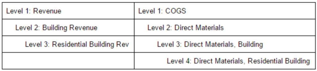
A hierarchy of accounts will make your reports much more useful – you can glance at a summary Profit and Loss statement to get a quick understanding of business performance, and then drill down into the detail accounts to identify the cause of any unexpected results. Create this hierarchy by using accounts and sub-accounts, also referred to as parent-child accounts. But be careful, your hierarchy will do more harm than good if you let it get out of control. To keep the chart of accounts in check, limit your hierarchy to no more than four levels, and make sure your accounts are grouped appropriately – see next paragraph. The below table shows an example of this chart of accounts hierarchy using the revenue and COGS accounts discussed above.
Step 2: Group Accounts into Smart Categories (Using ALERCE)
You should organize your accounts into meaningful groups, i.e. accounts that you’ll want to total up on your reports to help you quickly review performance. The top level groupings (Level 1 in our 4-level hierarchy) are fixed, they are the six generic account types (ALERCE):
- Assets
- Liabilities
- Equity
- Revenue
- COGS
- Expenses
Within each of these top level accounts, create sub-accounts (Level 2) that belong there, and then do the same for Level 3 and Level 4. Below is an example of what some of your expense groupings on your chart of accounts might look like.
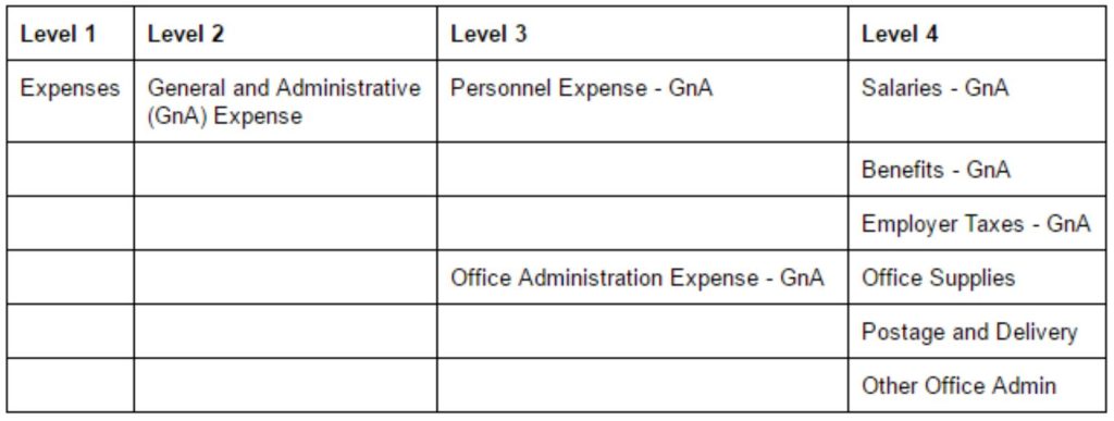
Grouping accounts under Personnel Expense and Office Administration Expense on your chart of accounts lets you easily see the total cost of personnel, or of administering the office. And, when necessary, you can drill down to the lowest level (Level 4) and see, for example, the exact cost of providing benefits to your team and how it compares to their salaries.
Step 3: Prevent Account Overload by Following This Simple Rule
Many business owners who are doing their own bookkeeping, or even some inexperienced bookkeepers, end up creating way to many accounts, especially for expenses. When it comes to keeping the chart of accounts organized, the expenses section can be the most challenging. To develop your hierarchy and create appropriate groupings within “Level 1 – Expenses”, follow these guidelines:
- Level 2: You should have only the following three accounts in your Level 2 hierarchy within expenses. Grouping expenses in these three categories allows you to calculate each as a percentage of revenue, which is how businesses nationwide monitor their Opex (Operating Expenditures) costs:
- General and Administrative (GnA),
- Sales and Marketing (SnM), and
- Research and Development (RnD)
- Level 3: Within each of those three broad categories, you should have no more than 10 accounts. These accounts should group the costs of your operations in a meaningful way, helping to answer questions about your business, such as:
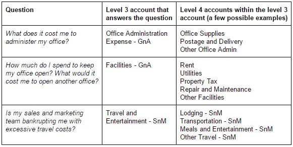
- Level 4: The lowest level account should still be a category of revenue or expense, not a specific person or item, i.e. never use a vendor or customer name, or a service in an account name. For example, you shouldn’t have an account called ‘Adwords Expense’. Instead, the account should be ‘Online Advertising Expense’. Use Items or Vendor Names (different tracking tools available in your accounting software) if you want to track costs of a specific service or vendor.
Key Takeaway: Don’t let accounts proliferate! Keep it simple.
Use This Chart of Accounts Numbering Template for Clarity
Use numbers to keep your chart of accounts hierarchy organized – since you have a four-level hierarchy, every account will get a four digit number. Start with ALERCE and then work your way down:
- Assets 1000s
- Liabilities 2000s
- Equity 3000s
- Revenue 4000s
- COGS 5000s
- Expenses 6000s
This is probably easiest to understand with an example, below is an example each for a liability, revenue, and expense account:
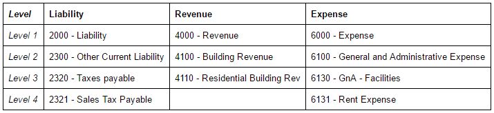
To see a working example of the entire hierarchy, click the button to download the chart of accounts template that we actually use as a starting point on our engagements.
QuickBooks vs. Xero: How to Implement Your Chart of Accounts
Implementing your finished chart of accounts in your accounting software is a little different in QuickBooks and Xero, the two most popular accounting packages for SMBs:
- In QuickBooks, you will want to create just a two-level hierarchy of accounts and sub-accounts (also referred to as parent-child accounts) using levels 3 and 4 of the hierarchy you defined. The QuickBooks ‘account type’ serves as level 1 in the hierarchy. Level 2 is completely excluded because the reporting limitations of QuickBooks – the expand/collapse function of QuickBooks reports can only show the highest or lowest level. The work around is to include the Level 2 abbreviation (GnA, SnM, or RnD) at the beginning of the parent account name (e.g. GnA – Facilities) to group accounts together on reports.
- Xero does not offer parent-child account functionality, which actually increases its flexibility – use the report layout designer to group your accounts into the hierarchy you created – the layout can vary by report to create summary and detail views.
FAQs About Chart of Accounts Templates
Q: What is a chart of accounts template?
A: A chart of accounts template is a structured list of account categories used to record every financial transaction in your business. It helps organize your revenue, expenses, assets, and liabilities for easier reporting and analysis.
Q: Why do most chart of accounts templates fail?
A: Most templates are built for tax filing, not business operations. They lack proper hierarchy, matching revenue/COGS accounts, or clarity for decision-making—which means you can\’t see your true margins or track performance accurately.
Q: What is the best chart of accounts format for small businesses?
A: The best format is a four-level hierarchy organized by ALERCE (Assets, Liabilities, Equity, Revenue, COGS, Expenses). This format supports both clarity and operational insight across departments and product lines.
Q: How should I structure my revenue and COGS accounts?
A: You should create matching revenue and COGS accounts for each product or service line. This allows you to calculate true gross margins and compare the profitability of different offerings.
Q: Should I let my CPA set up my chart of accounts?
A: No. Your CPA’s focus is on tax compliance, not operational clarity. You need a chart of accounts that supports real-time business decisions—not just year-end filings.
Q: Can I use the same chart of accounts in QuickBooks and Xero?
A: Yes, but implementation differs. QuickBooks supports sub-account hierarchies; Xero uses a flexible report layout designer. The core structure can remain the same with minor adjustments.
Q: What is the ALERCE structure?
A: ALERCE stands for:
– Assets
– Liabilities
– Equity
– Revenue
– Cost of Goods Sold
– Expenses
It’s a best-practice framework for organizing your accounts.
Q: What’s the benefit of numbering accounts?
A: Numbering accounts (e.g., 1000s for Assets, 2000s for Liabilities) keeps your chart clean and easy to navigate—especially as the number of accounts grows.
Q: How often should I update my chart of accounts?
A: Review it at least annually—or whenever your business model changes significantly. Adding new products, departments, or pricing models often requires updates to your account structure.
Q: Where can I download a free chart of accounts template?
A: Right here on this page. Just enter your email to get immediate access to the exact COA template we use with our clients at PlotPath.
Ready To Redesign Your Chart Of Accounts?
Follow these tips and you will actually enjoy reviewing your PnL and Balance Sheet – and you’ll be able to make better, faster, more-informed decisions. Don’t hesitate to get in touch with us if you need a hand. Good luck!


